A strong web presence is vital for any business in any niche. While it may seem surprising, this is especially true for the health and fitness industry.
According to recent research findings, nearly 75% of US internet users have gone online to find health-related information. Moreover, the fitness and weight loss industry is one of hottest, most popular, and highest money-making niches online.
Never before has it been so important for health and fitness brands to have a strong, engaging, user-friendly digital presence.
Here are five things to consider when designing for the health and fitness niche.
1. Responsive Web Design is a Must
We’ll get the most obvious point out of the way first. Responsive web design isn’t a new topic; by now, most designers have embraced the importance of a mobile friendly site.
However, there are a few industry-specific factors to consider. For example, many health sites and blog posts have a ton of information. Thoroughly covering a topic—symptoms, treatment options, side effects, and more—is expected by visitors. Content-dense sites need to still be user friendly on smaller screens.
Similarly, health content usually contains extra links. To back up findings and statistics, websites must cite their sources. Be sure the links are easy to click on mobile devices.
2. Flat is Healthy
Flat web design is all the rage these days. While it might not be ideal for all industries, it does lend itself well to the world of health and fitness.
Users in other niches will expect innovative, creative, push-the-boundaries design. Health and fitness users are generally more practical. They want sound, credible, applicable information. Generally, a simple (but not boring), minimal, content-rich, approachable, distraction-free site is what they are looking for.
For example, this health site sells vitamin injections. Convincing a visitor to buy any health product—but especially vitamin injections—requires quite a bit of faith. It’s better for the design to be clean and crisp than flashy and abrasive.

3. Typography is Tricky
These days, there is an overwhelming amount of typography options available. Us creative types tend to gravitate towards the most unique, flashy styles.
However, when designing a health site, it is important to remember the main function of the site—to provide useful information. Since the content is the most important element, legibility and readability need to be a top priority.
Remember to use san-serif fonts for the bulk of the text. Serif fonts can be used sparingly for headings and less essential information.
Also, it is important to embrace consistency. If there are drastic design changes between one page and another, users might think they’ve strayed onto a different (less credible) site.
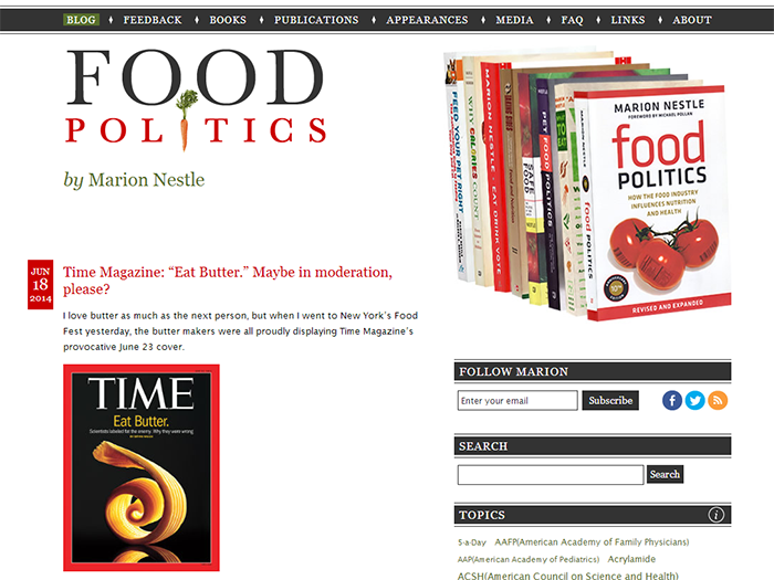
Look how Food Politics keeps things simple. The typography isn’t overpowering. The serif fonts are kept to a minimum.
4. Scroll-Free Navigation
Logical navigation is one of the most important parts of any web design. Visitors want to quickly and easily access the information they want.
If you haven’t already broken the habit of including horizontal scrolls, do it now.
Also, consider ditching the fixed header navigation bar that is only visible at the top of the page. As we’ve mentioned, health sites are usually chalked full of information—think long, in-depth blog posts. If they actually make it to the bottom of the page, users won’t want to scroll aaaaalll the way back up to the top. So don’t make them.
Watch how the primary navigation links and social share buttons stay in place as you scroll through the UnityPoint site.


5. Be Color Conscious
Think back to your basic design training. Do you remember discussing the psychology of color? Dust off those foundational skills and put them to work.
If the purpose of a site is to offer specific or obscure products and services, non-traditional colors might be used. For example, the colors red and orange create a sense of urgency. Therefore, they might be used for a site about a dangerous health issue that requires immediate attention.
Otherwise, health and fitness sites should usually stick with tried and true color schemes.
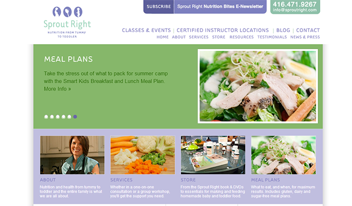
- Green portrays life, naturalness, restfulness and health
- Blue is equated with spirituality, peace, loyalty, trustworthiness, and security.
- Purple is calming and soothing. It expresses wisdom and sophistication.
- Black is powerful.
Here are several examples of wise color choices in the health industry.
Web design needs to be adaptive; it needs to adjust to the industry. Since health and fitness topics are booming online, it’s important to take these niche-specific tips into consideration.
Jessica Adams works for a marketing and design firm. They’ve help several clients in a variety of industries design effective websites. You can find Jessica on Google+.

