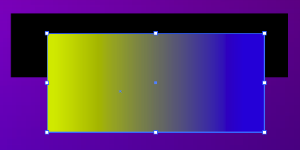
by jamesgeorge | Oct 14, 2010 | Illustrator, Quik-tips, Tutorials
You can control the opacity of each individual color of a gradient inside of Adobe Illustrator. This is fantastic for flexibility with colors. Simply click on the color swatch of the gradient, and there is an opacity setting on the gradient panel. You can also double...

by jamesgeorge | Oct 14, 2010 | Illustrator, Quik-tips
You can easily control the opacity of colors in Illustrator. You can Control the opacity of the stroke and the fill individually by using the appearance panel. Directly under each stroke and fill layer in the appearance panel, there is an opacity section, where you...
by jamesgeorge | Sep 14, 2010 | Articles, Indesign, Quik-tips
You can set up a good grid from the start of a new document in Indesign. When the New Document pops up, you can set the number of columns in your document. I tend to use either 3 or 5 columns. You can use as many as you want. I tend to try to keep it simple and to the...
by jamesgeorge | Aug 11, 2010 | Quik-tips
When creating type in Photoshop, and you are looking for just the right display face, it helps to use the key commands to get things just how you want them. If you double click your text icon next to the layer, it will highlight your text. Then, simply go up to the...
by jamesgeorge | Jul 26, 2010 | Quik-tips
You can easily make a path a selection, and make a selection a path. You have a lot of flexibility, because you can also make a mask a selection, which you can make into a path, or you can Command-click (ctrl-click on the PC) a layer with an object isolated on it, and...
by jamesgeorge | Jul 26, 2010 | Quik-tips
The masks panel is a big help, because you can easily edit and refine your masks via a handy panel. From the masks panel, you can define the density of your mask, which is very handy. Instead of having a black and white mask, the density setting lessens the affect, as...
