As a business owner, you need an eye-catching website to let people know as much as possible about your business. But if your website is not very usable, or user friendly, you won’t accomplish your goals. In most cases, you don’t have to scrap the entire website and start over. You simply need to concentrate on making a few changes to the site to increase its usability. Among the things you should do is include features like infographics, make the site responsive and focus on more concise content. By making some of these changes, you’re going to have a site people will enjoy browsing and you will be more likely to accomplish your business goals.

Start Using Infographics
Like it or not, the majority of people browsing the Internet have a short attention span. You cannot hit people with a thousand words describing everything you do and how you do it. Instead, you need to give them the most important elements of what your company offers. Keep in mind that infographics are eye-catching because of the use of colors and images. This means your visitors will instantly pay attention to the infographic and will likely get more out of it than if you tried to do the same thing with content alone. As a matter of fact, infographics are a perfect accompaniment to content because you can include all of the information in both places. This way, if the people looking at the infographic want to read more about the subject, they can refer to the content on the page. You may even notice that your visitors start sharing your infographics with their friends through social media. Using infographics creates the potential for information about your business to go viral.
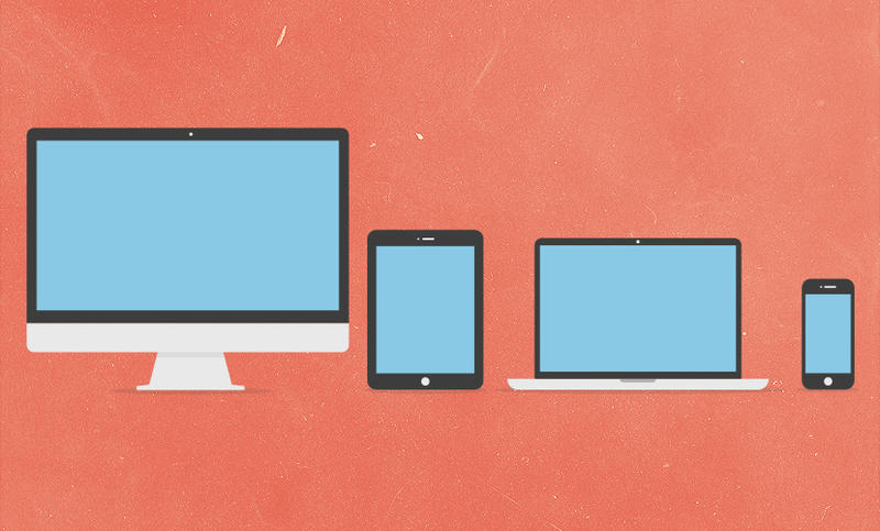
Improve the Site with Responsive Design
More people use smartphones than ever before. More important, they’re trying to access your website through their smartphones. This is a problem if you have a site that is not designed to be viewed on a mobile device. You can alter your site to include responsive design so it can be viewed on smartphones and tablets alike while still being just as viewable on a standard PC. The key is making sure the site automatically changes to fit the size and resolution of the screen. The images you have on the main site should still be viewable on a smaller screen, but maybe with a slight change in appearance. Also, some of your grids can be altered to better fit the screen. If you have a grid that is 2 up and 3 across for desktop optimization, the grid will switch to 3 up and 2 across for the smartphone. These changes will happen automatically and should not result in going to a separate site made just for the mobile version. This allows you to make one update to the site whenever adding new content and people can easily view your website using any device that has access to the Internet.

Stop Writing Novels on Your Site
As mentioned above, people have short attention spans online. As such, your content needs to be written with this in mind. Studies suggest that people skim pages rather than actually reading through them completely, according to Mashable. This is partly because there are so many sites out there, but it’s also because people tend to be doing something else while they’re surfing the Internet. Don’t expect your visitors to read and digest thousands of words of content. One study even found that usability increases by 58 percent when you cut the words on the page in half. Take a hard look at what you’ve written and find a more concise way to say it so you get the results you’re looking for.
Include Layered Landing Pages
Your home page is not your landing page. So many websites make this mistake. If you’re looking to purchase a cash drawer and you find one from Shopify only to be sent to the homepage, it will confuse and annoy you enough that you will simply look for another store to buy what you want. Instead, you should be led to a landing page that corresponds with what you were searching for in the first place. The best idea is to create multiple pages that can be navigated to from the home page or the products page so people can land directly on these pages from other sources. Make sure these landing pages include navigation to the rest of the site as well. This way, even if customers landing on your page want to buy one product, they may be inclined to take a look around to see what else you have to offer.

