
Responsive CSS Frameworks You Will Love
We all like to save time and effort when creating websites for our clients. No one wants to reinvent the wheel. One way that we can do this is by implementing responsive CSS frameworks to get us started in our projects. Responsive design has exploded lately. These responsive css frameworks will help you to create beautiful responsive websites much faster than if you had to create them from scratch. You can get the layout of a site set up in little or no time at all. Below are some responsive css frameworks that you will love using in your web design projects.
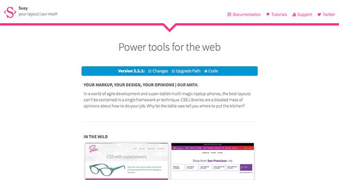
Suzy
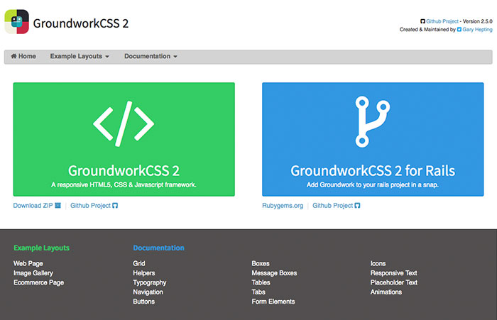
Groundwork CSS 2
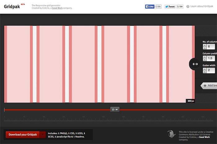
GridPak- Responsive Grid Generator
Base

Gridless

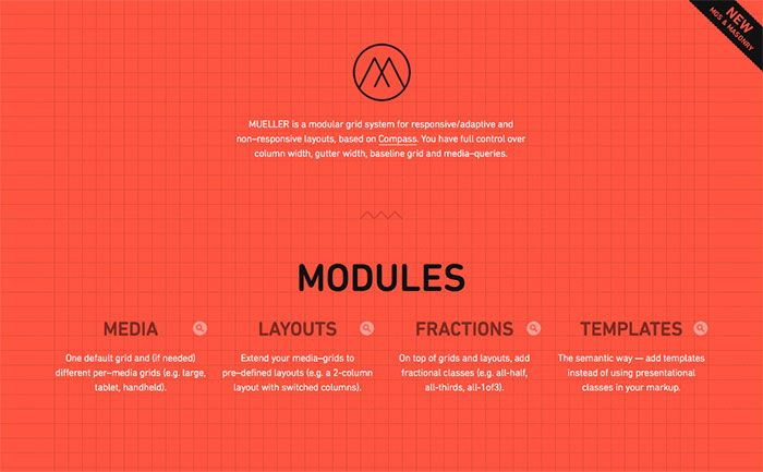
Mueller Grid System
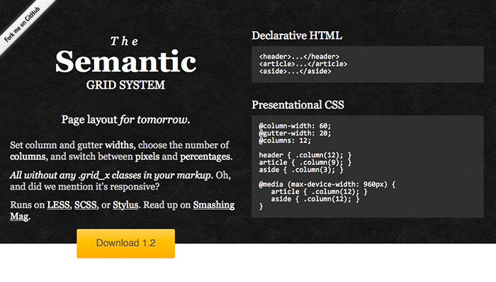
Semantic Grid System
Sassaparilla

Responsive Grid System

Responsive Aeon

Profound Grid System

Twitter Bootstrap 3

Foundation 5

Titan Framework

Initializr

Ingrid

Responsive Grid System

Golden Grid System

Gumby 960 Grid Responsive CSS Framework

Responsive Grid System

Yamb

Frameless

Skeleton

1140px CSS Grid

BluCss

Conclusion
Responsive Css Frameworks enable your site to look great on large monitors and small devices at the same time. They contain break points where the content restructures when the screen becomes a certain size. It will reflow at smaller sizes such as mobile devices. Responsive CSS Frameworks allow you to create responsive sites without having to make all of the calculations on your own. Responsive CSS Frameworks are pre-built so that you can focus on the content and not on how to structure your site.
In the examples above, you have a wide variety of choices available. You can choose from many different grid systems. You can also select an html5 framework. Twitter bootstrap is really hit right now, and many developers are creating sites based on Twitter Bootstrap.
Do you use responsive css frameworks in your web development projects? If so, which ones do you use? Are some easier to use than others? Are some complicated? Do they work in all browsers or do you have to create workarounds? Be sure to leave your responses in the comments section below.

